Pee Dee Electric Cooperative
Project Scope
Brand Identity
Digital Design
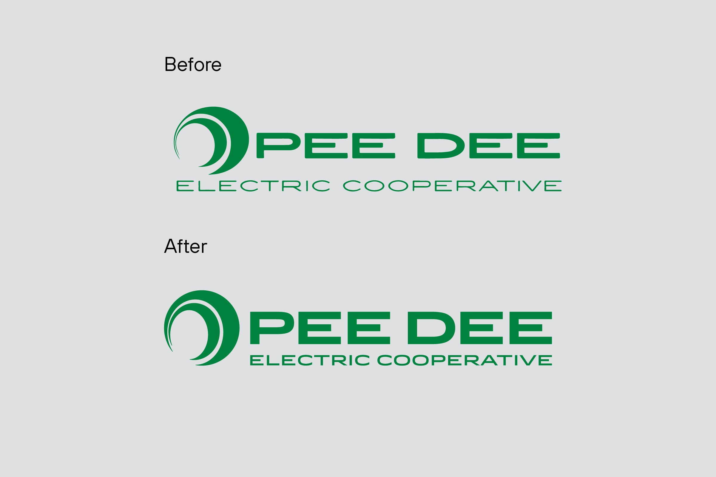
Pee Dee Electric Cooperative had built tremendous equity in their existing logo over the decades and did not want to completely rebrand; however, they did recognize that the logo could be improved, especially to work better in digital applications. With a new website in development by Townsend™, it was an ideal time to retool the utility company’s identity.
We redrew the circular mark, improving its geometry and making it bolder to work better as a small icon in apps and social media; and updated the type to display better on screens. While greatly improving the logo’s look and performance, the subtlety of the refinements would allow the new logo to work in the marketplace alongside existing applications that featured the old logo.
The project also gave the company the opportunity to create a secondary logo utilizing the company’s initial, PDEC, as customers and employees alike often shorthanded their lengthy name. We then developed basic identity guidelines, including an updated color palette, to help the company’s marketing department better maintain brand consistency across various digital and analog applications.
The first application of the updated logo was a new Pee Dee Electric Cooperative website, which we developed to be more user-friendly by being responsive to the device type, from desktops to mobile phones, that the customer chose to view it on.