Redefining a local institution
Florence 1 Schools
Project Scope
Brand Strategy
Brand Identity
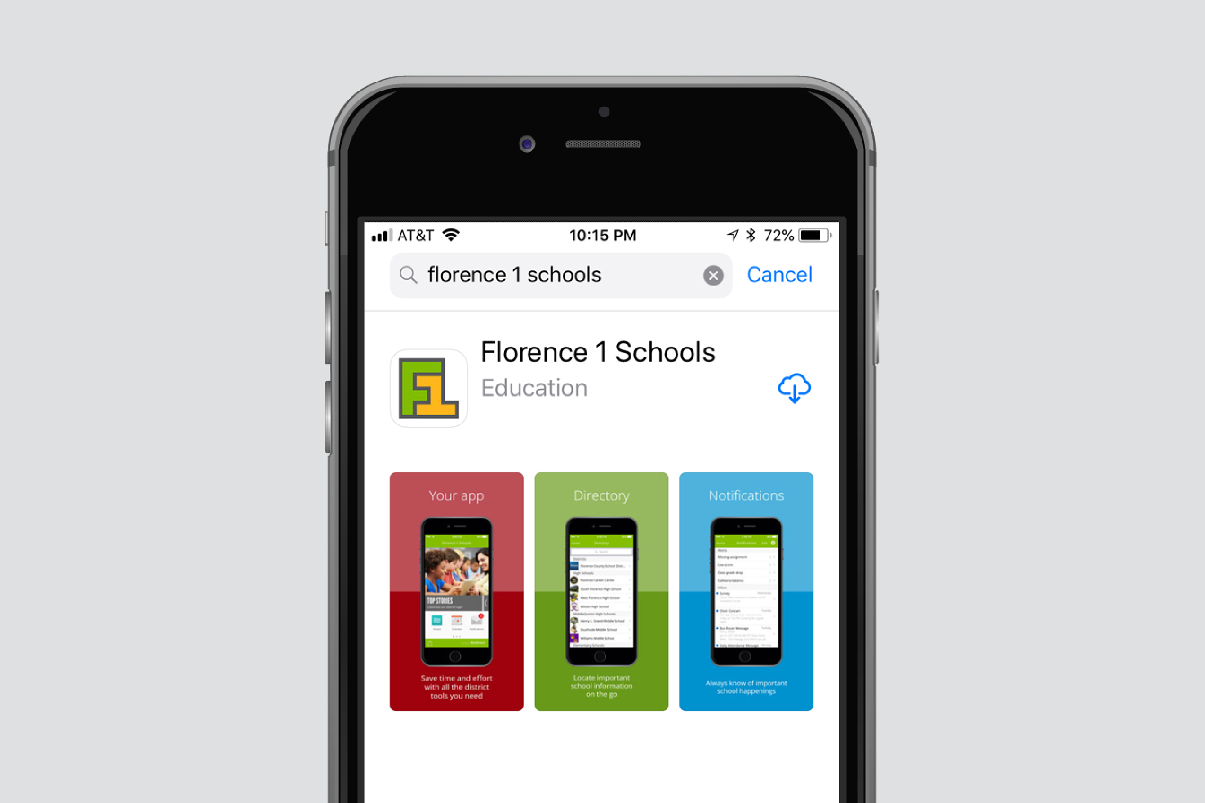
Digital Design
Print Design
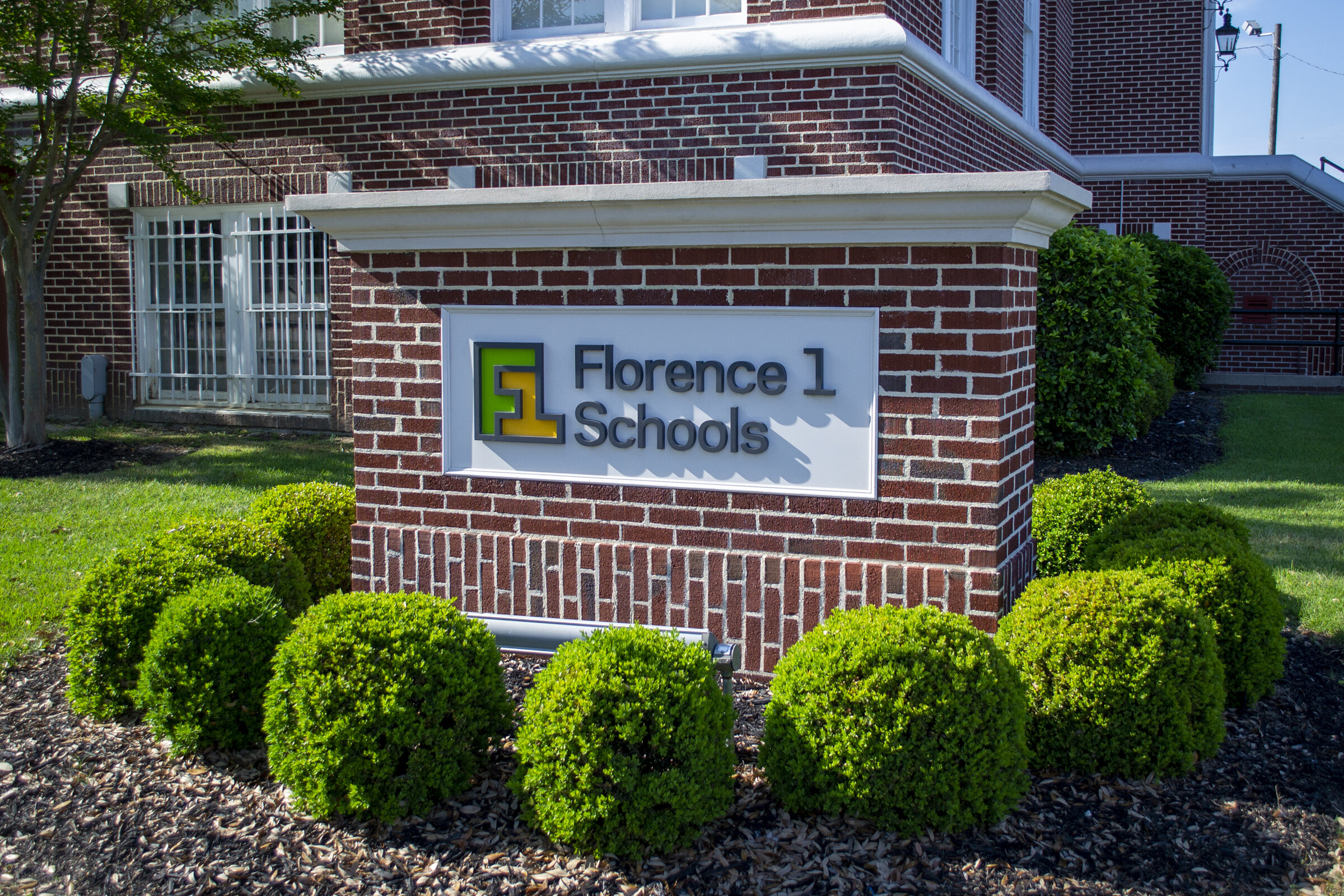
Environmental Design
Advertising
Florence Public School District One is the second largest employer in the community with a $160 million annual operating budget, but it wasn’t being seen as a vital local business. And while individual schools and their accomplishments were widely acknowledged, those successes—and the resulting good will—were not being transferred to the district as a whole.
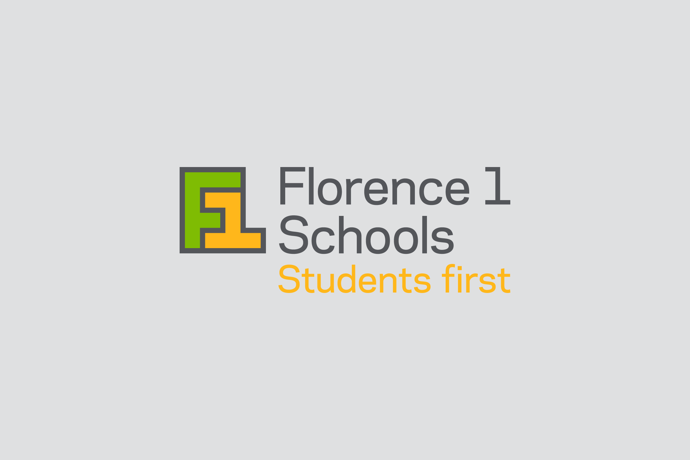
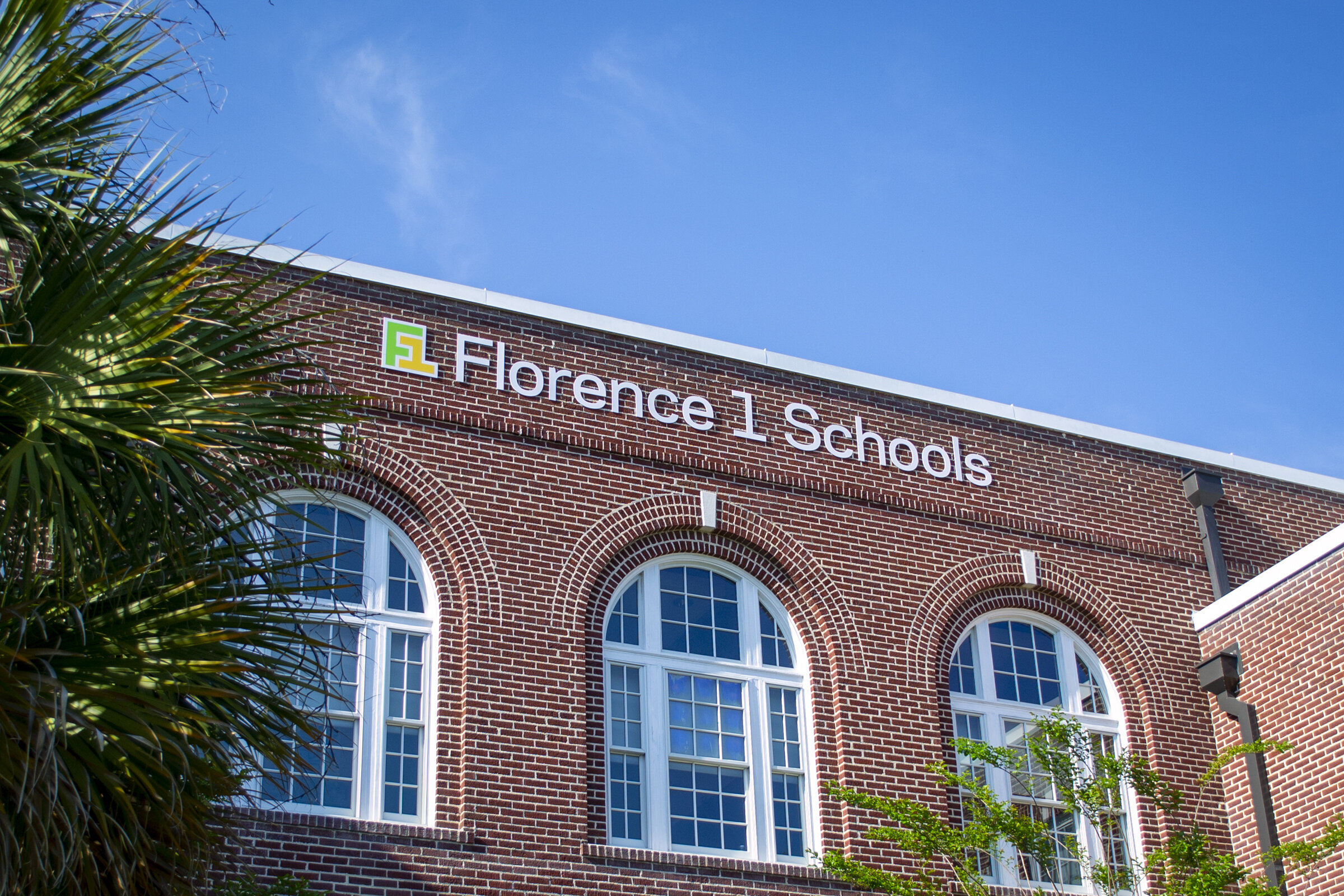
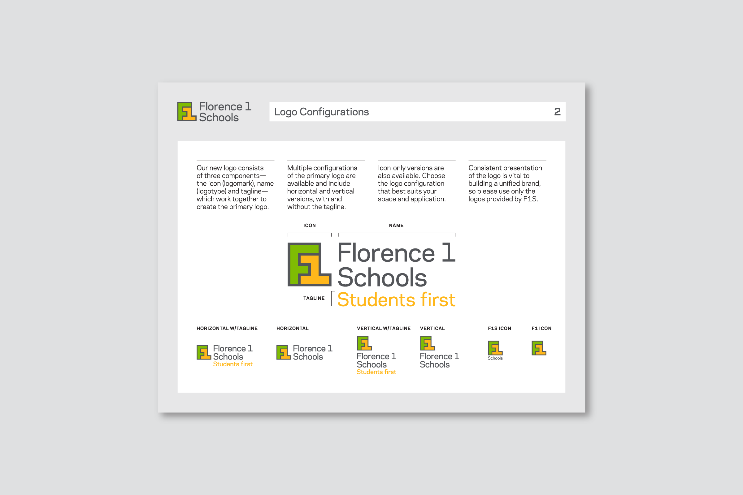
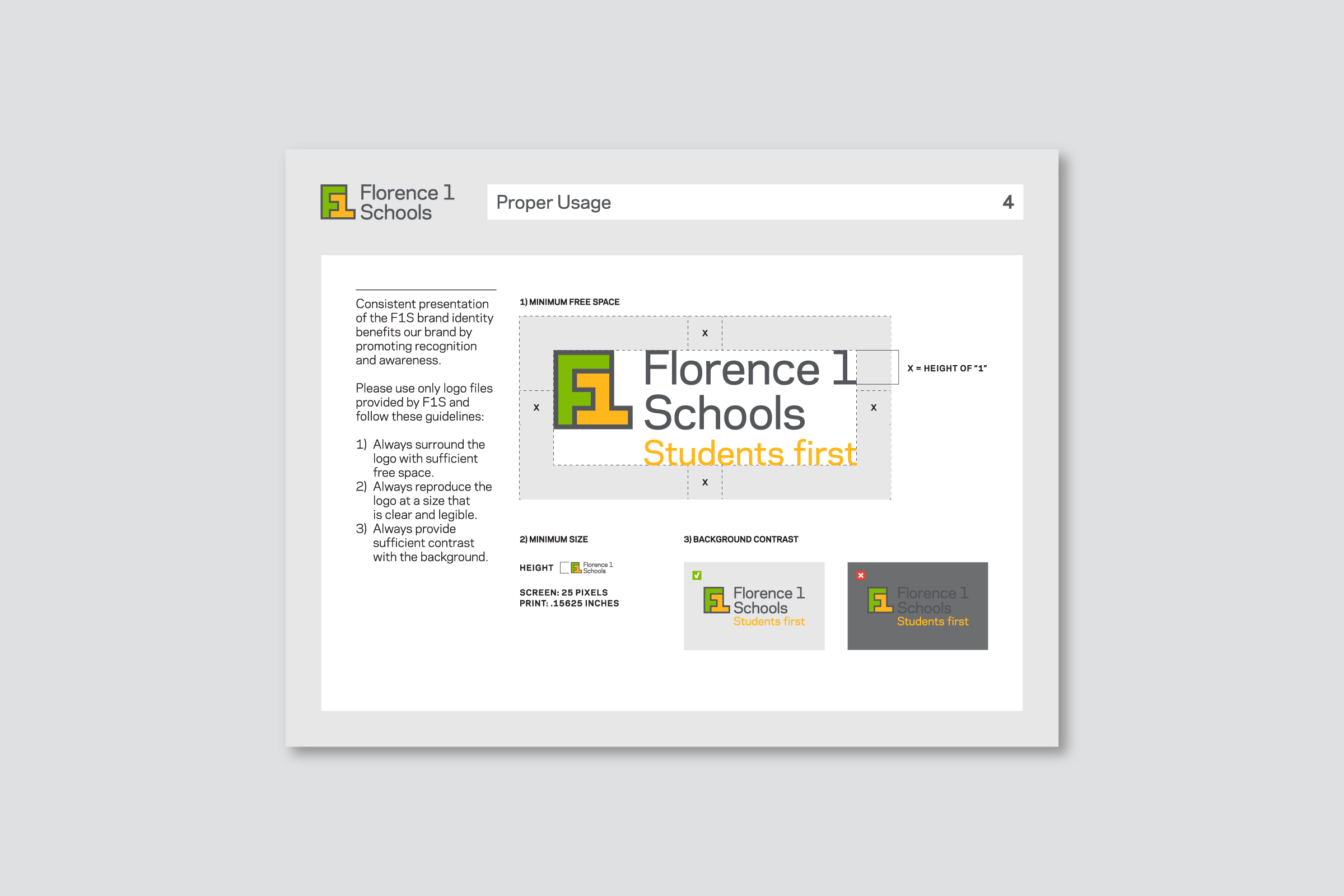
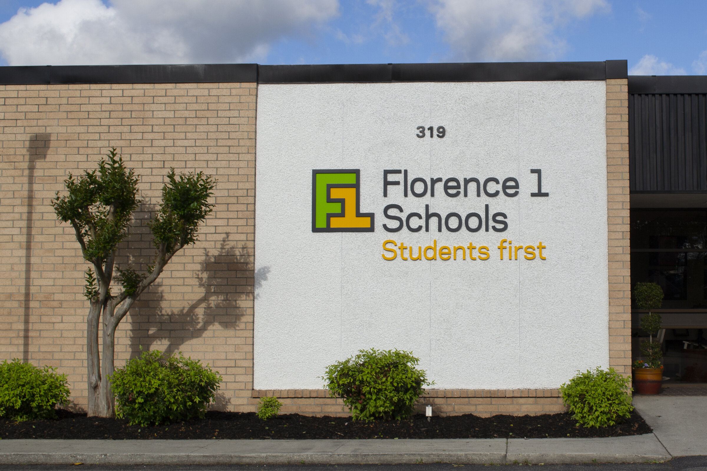
To help the district take control of its reputation and rally its 25 schools and programs, 16,500 students, 3000 employees and the communities they served, we simplified the district’s name to Florence 1 Schools and developed a new brand identity based on the brand essence of “Students First.” Rather than leaning on childlike imagery as many school districts do, we purposefully designed the identity with a more professional, corporate look to reflect the district’s role as a serious driver of the local economy.
Designed to both embrace the strengths of individuals and the power of working together, the identity features gold—a color shared by the district’s 3 high schools—as a primary color, and the logo has the flexibility to take on the identifying colors of each school. The other two colors are green, representing continued growth, and graphite gray, representing stability and traditional values.
To launch the new brand and help break down silos between individual schools, the district held a back-to-school convocation announcing new, district-wide initiatives, where all 3000 employees symbolically wore shirts printed with the brand launch theme of “We Are One.”