South Florence High School
Project Scope
Brand Strategy
Brand Identity
Digital Design
Print Design
Environmental Design
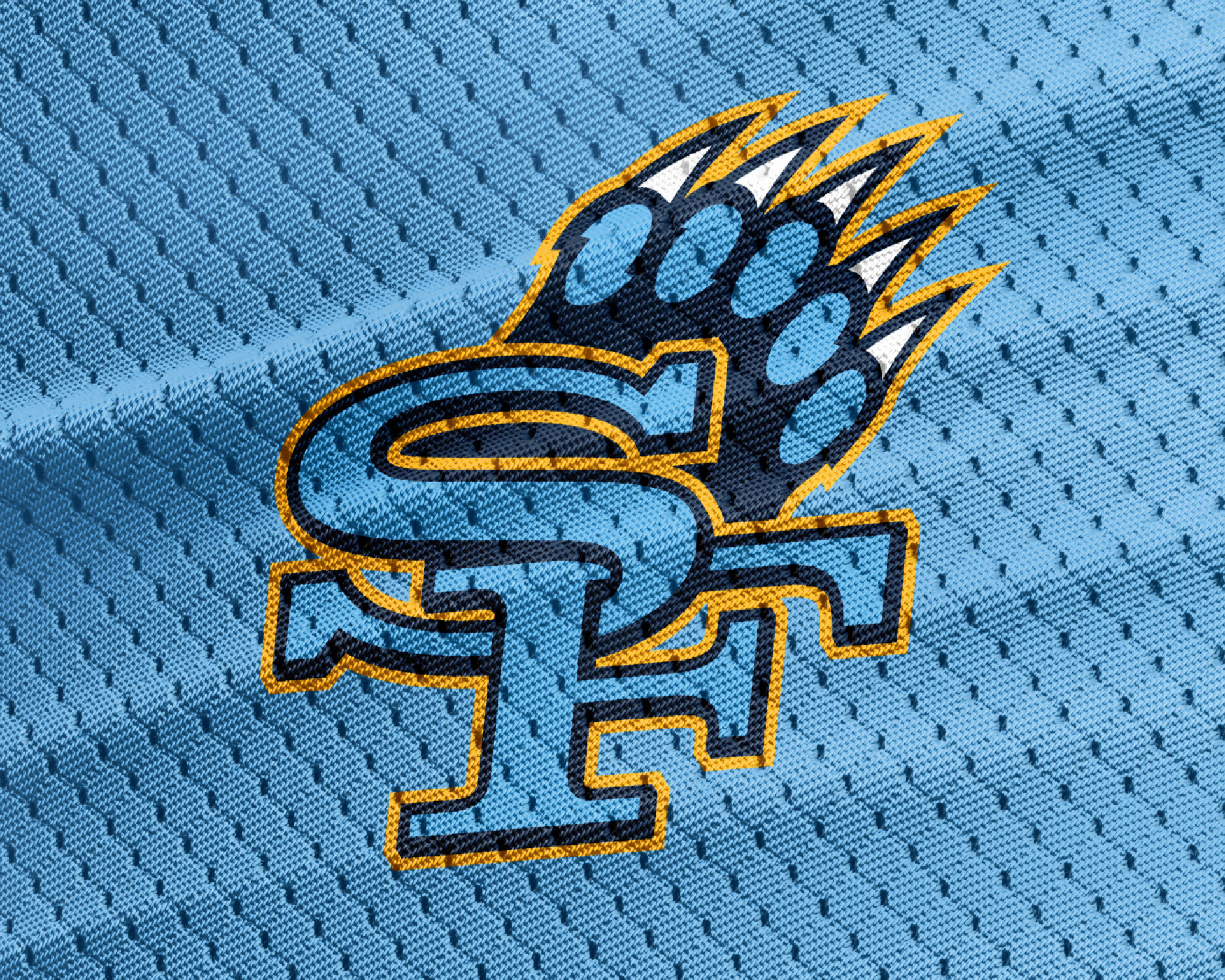
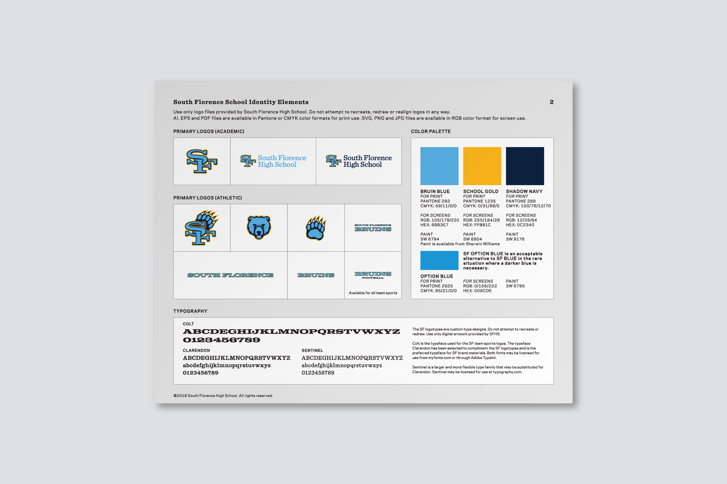
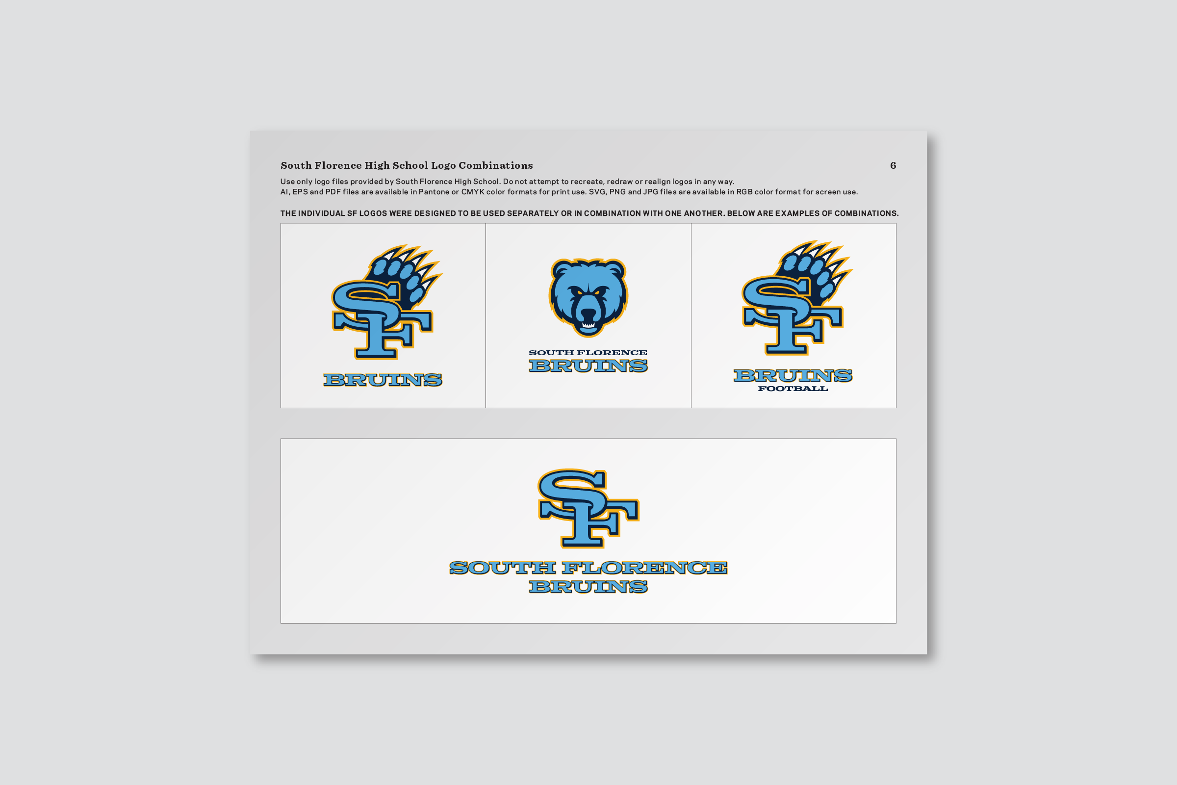
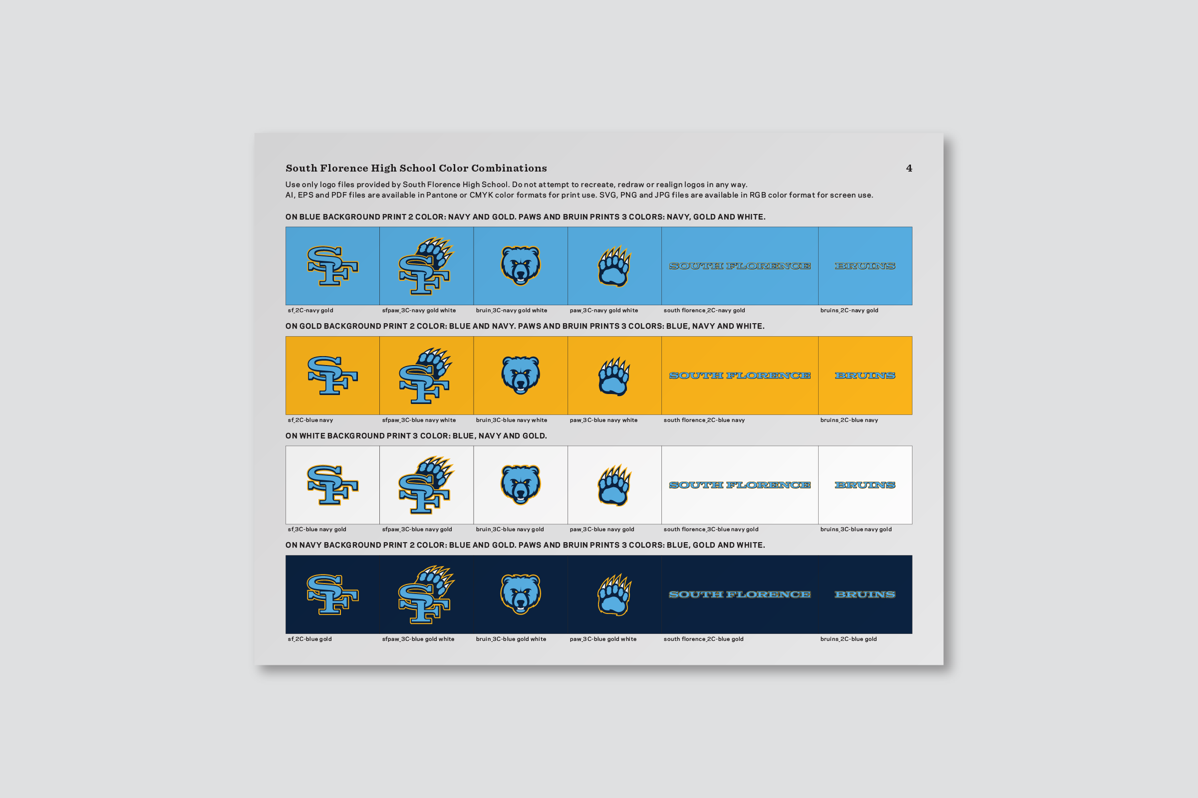
South Florence High School has been using the familiar SF monogram as an identifier for decades; however, the logo, as well as other core identity elements like colors, tended to vary in style depending on the vendor the school was working with. We created a definitive, ownable brand identity for South Florence that expands on a new redrawn SF monogram by adding elements like the bruin paw, custom logotypes bases on the SF typography, and a distinctive bruin mascot. After establishing brand identity guidelines—which included specifying school colors for printing, digital applications and paint—we applied the new look to items like uniforms, basketball courts and merchandise.